Fitness App - Personal Project
BWM Tracker is a personal fitness app I built to have fun logging my workouts and keep my trainer up to date on my progress.
Why I built this
My personal trainer runs his business on Google Sheets. I'm supposed to fill it in every day with all my health related metrics - macros, weight, steps, sleep, hunger, cravings, workouts. And once a week, I upload images to Google Drive and film a video check-in on how my week went. He reviews all this data on Mondays.
Filling a spreadsheet from my phone was a mess, since spreadsheets aren’t designed to be mobile first. But depending on my computer made me avoid logging most of my days, especially on weekends when I was away from my computer.
I also wanted to build an app from scratch and thought this would be a good opportunity to give it a try.
There was no real goal beyond making my everyday logging easier.
Shaping around technical constraints
I couldn’t get rid of the spreadsheet because it’s the template my trainer uses for all of his clients - I wasn’t expecting him to change his workflow just because I wanted a “prettier” experience. He also has a lot of formulas set up which auto-populate the sheets, so intervening his existing spreadsheet wasn’t an option either.
Instead, I set up my app to write to a clean sheet with a schema that I control, and then linked my trainer’s original spreadsheet to mine using some VLOOKUP formulas. This lets me redesign the data model whenever I want without breaking his workflow, and potentially gift this to other clients of his in the future, without having him relearn any programs.
📸 To make in Figma: A simple architecture diagram. Phone app → my clean sheet → VLOOKUP → his template. Three boxes, two arrows. I'd put this near the top of the case study, maybe even before the design shots.
What I built
A Next.js progressive web app (PWA) that I installed as a homescreen shortcut.
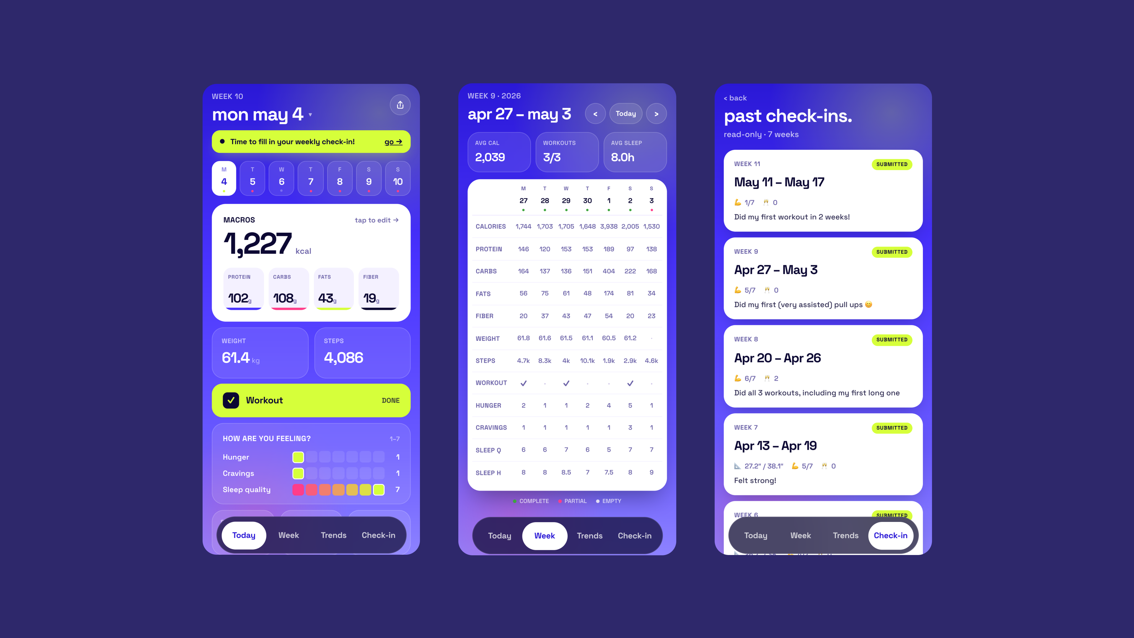
I started with the main Today view, where I log everything for the current day. I organized the log categories by the time of day I log them. Sleep first, because I log it when I wake up. Weight after that. Then activity (steps, workout, ate out, drinks). Then nutrition. Then wellbeing. Then notes.
Check-in is the Monday ritual. Weekly weight, measurements in inches, wins and struggles, three progress photos and a video uploaded straight to Google Drive.
I then added the Week view, is a 7-column table for the current week, with green pills marking what's filled and a quick visual on momentum.
Trends is where it gets fun. Sparklines for any of 15 metrics, a day-of-week chart, Pearson correlations rendered as plain sentences ("more sleep hours → less cravings"), and a streak drawer with 8 goal rows.
Design decisions worth talking about
Cards that put themselves away when they're done
Each section on Today has a completion condition. Once everything in a card is filled, it collapses on its own after a beat. The icon turns green, a check appears in the corner, and the card shrinks to a header bar so the next one is right where my thumb is.
I had the auto-collapse delay at 1.5 seconds at first and it drove me up the wall. The card would zip closed before I could look back and confirm I'd typed the right number. Tuning it up to 4 seconds fixed the feeling — long enough to glance, short enough to feel responsive.
🎞️ Video to film on phone: Filling protein, carbs, fats — Nutrition card softly collapsing into a green-check header. The smooth height animation uses a CSS grid trick (0fr → 1fr) instead of measuring heights in JS, which is why it feels clean.
Color on the 1–7 scales
A lot of the daily log is on 1–7 scales — sleep quality, hunger, cravings. Naked number buttons read like a quiz. I mapped them to a red-to-green gradient (and inverted it for hunger and cravings, where low is the good end) so the meaning is in the color before you even read the number. Tapping a 6 on sleep just feels good in a way that tapping a button labeled "6" doesn't.
Before / after — the 1–7 scale design decision:
Bottom sheets instead of inline inputs
Every number input opens a bottom sheet with a custom numpad. I tried inline inputs first and the iOS keyboard kept yanking the page around every time I tapped a field. Bottom sheets pinned the input position, which meant my thumb wasn't moving between taps, and it made per-field auto-save much easier to think about — the value commits when the sheet closes.
It does cost an extra tap per field, which I went back and forth on. In the end the rhythm of typing-then-confirming felt better than the chaos of inline inputs.
The macros bottom sheet — four tabs (Protein/Carbs/Fats/Fiber), a single big readout, and a custom numpad. Closing the sheet commits all four values at once.
🎞️ Video to film on phone: Tap weight → bottom sheet slides up → tap a number → tap Done → sheet slides down with value in place. The slide animation matters; capture on device.
The Playful Purple redesign (and the dark version coming after)
The first version of the app was functional but visually flat. White cards on a white background, the kind of UI you'd get if you described "fitness logger" to a stranger.
I rebuilt the whole thing in late spring, and the honest reason I did it is that Claude Design had just launched and I wanted to use a real project to try it out. I started by collecting references on Mobbin — I spent a few evenings just scrolling, saving anything that felt like the right energy. Floating bottom navs with animated pills, gradient backdrops, bottom-sheet inputs, color-graded scales. I wasn't trying to copy any single app; I was trying to find the feeling I wanted before I started moving pixels.
What I landed on was a deep purple gradient background, a floating bottom tab bar with a pill that slides between tabs, bottom sheets for every input, and a slight playfulness in the small details (the supplement chips, the confetti when you hit your third workout of the week). The point of the redesign wasn't really to look better — it was that the first version had taught me what I actually used the app for, and now I could design for that instead of for a generic fitness logger.
I've since been working on a dark mode variant of the same design. The purple version is mine — I like it, it's me — but I think the dark version reads as more grown-up, and I'm planning to gift the app to my coach to use with his other clients. The dark version will probably be the default for them, with the purple as an option for anyone who wants it.
Before → after — the redesign:
When dark mode ships, this becomes a 3-panel comparison (v1 → purple → dark). The dark variant will likely be the default for coach-distributed instances.
📸 To make in Figma: A small grid of the Mobbin saves that fed into the redesign. Showing the references is honest about where the visual language came from and it's the kind of process artifact a senior reviewer actually wants to see.
The streak drawer (which I redesigned three times in two days)
When I first added the streak drawer, I let Claude design the layout — a colorful per-metric dot grid in lime green, with a global show/hide toggle at the top. It looked impressive in screenshots and was useless in practice. The colors were loud, the toggle was an extra interaction I never wanted, and I realized I was looking at the streak number and ignoring the dots entirely.
I redid it in three passes over a weekend:
The first pass dropped the global toggle and made each row collapsible on its own, so I could open just the one I was curious about. The second changed the dot color from acid lime to the same purple I was using for positive correlations elsewhere — the lime was visually screaming compared to everything else on screen. The third pinned the whole sheet to a fixed height so opening a row scrolled inside the list instead of pushing the streak counter up off the visible top.
I'm including this because it's the bit of the project I'm most honest about iterating on. Nothing about the streak drawer was right the first time, and I had to live with it for a few days each round to know what was wrong.
The final streak drawer:
Small playful things
Confetti fires when the third workout of the week flips on. Three workouts is the program target, so it's earned, not noise. The first time it happened in real life I texted my coach a screenshot.
The date header on Today reads "today" or "yesterday" before falling back to "wed apr 30." Above that, in small caps, "WEEK 9" — but week 1 is the week I started the program (March 2, 2026), not the calendar week-of-year. It's my program clock, not Google Calendar's. Tiny detail, but it makes the app feel like it's actually mine.
Correlations as plain English
"What moves your weight" — Pearson correlations rendered as natural-language sentences with tight-link / loose-link badges. The math is unremarkable. The phrasing is what makes the page feel like an app instead of a stats readout.
Working with Claude
Claude Code did the implementation. I designed and made the calls. I think that's worth being clear about — what's interesting isn't that I used AI, it's how I used it and what I chose to push back on.
A few moments I remember:
The three-dots menu. Claude implemented the manual "push to spreadsheet" action behind a "⋯" dropdown menu in the top right of Today. It was the obvious pattern and it worked fine, but after a day of using it I realized two things — the overlay was fighting the z-index of my floating navbar, and the dropdown was an extra step before what was already a one-button action. I asked it to swap the dropdown for a single share icon that opens the bottom sheet directly. Same action, fewer taps, less z-index drama.
The lime green dots on the streak drawer. Same story as above, but worth saying separately. Claude's defaults trend toward visible, distinct, colorful — which is great when you're showing off a feature in a screenshot and not great when you're using the app every day next to seven other things on the same screen. I'm the one who said "the lime is too much, make it the brand purple."
The "let's log today" subtitle. Claude added it on the Today screen as a friendly little tagline. I removed it. The screen is already titled "today" with the actual date right below it — saying "let's log today" out loud sounded like a fitness app from 2014 trying really hard. This kind of thing — the corny copy thing — is the part where AI is consistently slightly off, and you have to be the one who notices.
💡 You should edit this section with the actual back-and-forth you remember. I picked these three from your commit history but they're going to land much harder if you swap in the real moments and even rough quotes of what you told Claude vs. what it had done.
What I'd actually say about working this way: AI is great at carrying technical weight. The Vercel Blob caching, the OAuth refresh tokens, the race condition fixes — none of that was design work and I didn't want to be doing it. Letting Claude handle it kept me in the design seat for the parts I cared about. But the taste calls, the moments where the obvious pattern is the wrong pattern, the noticing-that-something-is-corny — that's still on me, and I think it always will be.
Workarounds that turned into design problems
The magic link disaster. The first auth flow emailed a magic link. On a phone, tapping the link opened a new Safari tab, while the PWA on the home screen stayed on the login page. Two tabs, two states, completely confusing. I swapped it for a 6-digit code emailed instead — you stay in the app and type the code. The input is six boxes with iOS one-time-code autofill support, so pasting "123456" fills all six at once. (For embarrassing reasons the first version only filled the last box from a paste. Fixed within a day.)
📸 To film on phone: The 6-box input mid-paste with the iOS autofill suggestion bubble above the keyboard. The autofill flow is the part that matters — desktop can't show it.
Google Sheets was too slow to be the live database. Every keystroke save was hitting the Sheets API and taking 1–3 seconds, and concurrent saves occasionally lost data (typing protein, switching to carbs, watching protein vanish). I'd also hit the per-minute quota a few times. I moved the live data into Vercel Blob and reduced the Sheet sync to a weekly cron, plus a manual "push now" button on Today for when I want to force it. Saves are instant now. The check-in submission still pushes to Sheets immediately, because that's the moment where I want my coach to see the row land.
📸 Visible in the Today screenshot above — the small share icon at top-right of the Today header is the manual push-to-spreadsheet trigger. Tapping it opens a bottom sheet with one button and a "last synced" line.
Drive folder names had to stay the way my coach reads them. He reads photo dates directly off the folder names in Drive, so I couldn't switch to a cleaner weekly-folder naming scheme even though it would have been tidier on my end. Instead, the existence-check searches a shifted 7-day window (Tuesday → next Monday) so a Monday-night backfill counts toward last week's check-in. His convention shaped my algorithm, which is the same pattern as the VLOOKUP decision — keep his stuff intact, work around it on my side.
iOS PWA quietly broke background-attachment: fixed. The purple gradient relies on a fixed background, and iOS Safari downgrades that in standalone PWA mode without telling anyone. On long scrolls, the dark <html> color was bleeding through at the bottom as a hard line. Fix was a dedicated fixed-position gradient layer painted underneath everything by a React component. Looks the same on every device now, and nobody will ever notice unless they read this paragraph.
What this project is about, really
It's a personal project. There's no client, no metric, no deadline, and no real ambition beyond "I want this thing to exist for me." That changes what you optimize for. Without a business case forcing the decisions, every call has to justify itself on taste — and that's a different muscle.
The win I'd actually claim: I open the app every day on purpose. The Sheet I used to dread is now what my data quietly syncs into while I'm in a UI I like. That's it. That's the whole thing.
Where it's heading next is more interesting than where it started. The dark mode is most of the way there, and I'm planning to gift the app to my coach so he can offer it to his other clients. That turns it from "a thing for me" into a small product, and a real one — because the VLOOKUP-into-his-template decision from the very beginning means nobody has to switch anything. They can keep their Sheet exactly as it is, and the app just feeds it.
I think that's worth showing in a portfolio. Not because every project should be a personal fun one, but because the way you make decisions when nobody's grading them is probably more honest than the way you make them when someone is.
What I'd build next
- Dark mode shipped properly, with a settings toggle so people can pick. Most likely default for coach-distributed instances.
- Trainer comments inline on each check-in. They live in his Sheet right now and I never see them in the app, which means I miss them. They should be the first thing I see on the next check-in.
- A photo timeline. Every check-in photo as one scrubbable film strip. The single feature I most want to use that doesn't exist yet.
- Smart reminders. Tied to real gaps in my own logging behavior, not the calendar. "You usually log sleep by 10am — it's 11:30."
📸 To make: A quick mock of the photo timeline, or the dark mode in progress. Forward-looking close.
Built with Next.js 16, React 19, Tailwind v4, Google Sheets & Drive APIs, Vercel Blob, iron-session. Designed and directed by me, implemented with Claude Code. References pulled from Mobbin, redesign done using Claude Design.